Increasing Produce Sales by Design
January 1, 2017 | 10 min to read
The produce department is pivotal for retailers, as it significantly impacts customer attraction and retention. Experts emphasize the importance of visual appeal, utilizing lighting, signage, and display strategies to enhance freshness and accessibility. Proper inventory management, thoughtful layout, and capturing consumer demographics drive successful designs. Innovative refrigeration, such as upright cases, maximizes space and ensures product quality. Ultimately, striking a balance between bulk and packaged produce continues to shape the shopping experience while engaging diverse customer needs.

Lights, signage, tone and flexibility boost sales

Photo Courtesy of FFR Fresh
The produce department is a retailer’s chance to make a good first impression. Do it right and you’ll entice customers with abundant, diverse, fresh produce displays. Make it appealing, and you’ll keep consumers coming back. Do it wrong, and basket ring suffers.
It’s a challenge for retailers. Produce department design is a critical part of creating solutions to keep sales strong. “Survey after survey of customer opinion says one of the predominant reasons they shop a supermarket is because of the fresh produce department,” says Dan Hamilton of Hamilton Consulting in Bulverde, TX. “It’s a critical department for attracting new customers and retaining them,” says the former senior vice president merchandising, marketing and procurement of HEB. “If the produce department isn’t done right, you’re subject to lose the basket total.”
This is what keeps retail produce executives up at night. But focusing on a few key design strategies can accomplish the goal of customer retention.
Universal Appeal
Creating attractive, well-stocked displays is the goal of every retailer, but many face challenges in how to get there. Industry veteran Reggie Griffin of Reggie Griffin Strategies LLC in Okatie, SC, advises clients in various aspects of merchandising and operations. “First and foremost, the goal is product protection and then product appeal/viewing,” he says. “Fresh produce appeals to all the human senses — sight, smell, taste, feel — so to maximize those senses with your customers is paramount in building a fresh relationship with your customer.” The former Kroger produce executive stresses that perception is reality from the consumer’s viewpoint, so well-displayed, well lit products are critical.
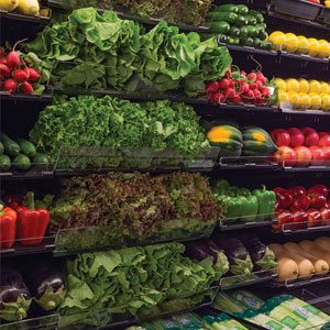
“The presentation is what grabs the customers’ attention and triggers their naturally occurring buying impulses,” says David Yehuda, president of DY Design, a layout, design and decor consultantcy for the foodservice industry, based in Kings Point, NY. “In the old days, the produce was just placed on tables. Today, the produce is raised up on an angle and stacked up so that your eye level is aligned with all the colors of the fruits and vegetables. The lighting color and temperature also enhance the real colors.”
Laura Manson, product manager at Florence, KY-based FFR Merchandising Inc., a retail design consultancy, sees success as a balance between plentiful-looking displays, but being careful not to overstock and lose profits to product shrink. “One way to achieve that look is to use fixtures that bring the product closer to the shopper, and shelves that are less deep,” says Manson.
This can be accomplished with inventory blockers used behind produce to limit the amount kept on shelves while maintaining a full look. Perforated blockers ensure proper airflow so product remains fresh.
 Marcy Britigan, owner of MEI Specialty Refrigeration & Fixtures based in La Grange Park, IL, stresses the need for good presentation. “Not unlike real estate where location, location, location are the key issues, we like to add presentation, presentation, presentation to the equation,” says Britigan. “A good location with poor presentation is a loser. A great presentation in a bad location can also be a loser, or certainly much less effective.”
For MEI’s design process there are several key components Britigan keeps in mind: consumer access, simple and effective presentation, limitations of space, flexibility and cost.
From the retail perspective, Maria Brous, director media and community relations at Publix Super Markets Inc., headquartered in Lakeland, FL, sees quality and freshness as the staples within each Publix store, especially for perishable departments. “Our goal is to always have the products our customers are looking for in-stock and a plentiful selection,” she says. “Throughout the year, there are opportunities to engage in more creative displays, and we encourage our managers to share their photos with us so that we may showcase them. There are also occasions to have secondary displays in our stores.”
Smart Layout
Retailers need to work within the space restrictions of the overall store, of course. Brian Gannon is the eastern sales manager at Pero Family Farms in Delray Beach, FL. He has retail experience gained from his time at Big Y Foods and Shaw’s Supermarkets. He believes great design creates a show for consumers every season, all year long. “It starts with the retailer’s strategy for produce and what are the sales and profit expectations for it in the business model of a retailer,” he says. “The positioning of produce within the building blueprint, and the space given, should support that strategy, and sales and profit expectations.”
Jonathan Raduns is a food merchandising and retail strategy consultant for FreshXperts based in Cherry Hill, NJ. He sees the produce department as a large dance floor that has interchangeable and removable fixtures on top of it. “Different retailers have different perspectives,” says Raduns, “but from my standpoint, the ability for a retailer to remain flexible and change up the look, change up the layout, keep things fresh, stems out of not having huge hardware in the middle of the department.”
Taking advantage of vertical space is also an option employed by many retail designers. “Vertical merchandising continues to be favored today,” says Manson at FFR Merchandising. “If done correctly, the customer sees a very attractive wall of produce. Produce SKUs continue to increase, and retailers are always looking for a way to add these items to their merchandising space and allow them the flexibility to make changes quickly while not sacrificing the visual impact.”
The designing stage is the time to think through all decisions and troubleshoot potential issues before construction begins in-store. “A mentor taught me a long time ago,” says Gannon, “whenever I had a chance to critique produce blueprints, that it was imperative that you speak up then on any negative, because once the blueprint is set, and the department happens as designed, you generally don’t get another opportunity for at least 10 years.”
Keeping Cool
Refrigeration shouldn’t be viewed as a restriction but an opportunity. “Retailers are paying more attention to refrigeration needs,” says Hamilton. “Maintaining that 32-degree window is critical so retailers are using a variety of cases that typically were not used in produce, such as upright cases versus a flat, low layer appearance. This also helps with space as it incorporates vertical space.”
“Certain commodities do better in certain environments, so I’ve seen case manufacturers responding to that by building the perfect case for a specific commodity.”
— Jonathan Raduns, FreshXperts
“We moved to having most of the refrigerated product in upright cases, as this presented a wall of fresh produce that was mostly bulk product and not packaged at the time,” says Reggie Griffin’s Griffin. “Now it is about 50-50. The display tables were mostly non-refrigerated, and these were for weekly specials and items that did not need refrigeration. With different size tables and elevations, we were able to build different elevations of product.”
FreshXperts has seen an increase in commodity-specific refrigeration, such as coolers designed specifically for berries. “Certain commodities do better in certain environments, so I’ve seen case manufacturers responding to that by building the perfect case for a specific commodity,” says Raduns.
Lighting & Signage

Photo Courtesy of Publix
The trend toward LED lights has had a positive impact on retailers. LED lighting, in addition to being more energy efficient, produces less heat. They can be brought closer to product without decreasing shelf-life. “Before LED, I had to suspend the light at 10 feet high above the finished floor or 7 feet above the product,” says DY Design’s Yehuda. “Now I can bring the fixture to 8 to 9 feet above the finished floor, which is about 4 feet from the produce.”
Dark, subdued walls with spotlighting also creates a contrast that has become popular with high-end retailers. “To me, this decision is based on creating an entire experience for the customer when they are in the store, which includes how it looks and how it feels to them,” says Yehuda. “The old concept was to brighten up the whole store so you will see everything better. The new concept is to create contrast with lighting, as you want to emphasize the products and bring more attention to them. A cozier atmosphere is created when the customer is not lit, but the products are.”
“Lighting and signage are absolutely critical to the effectiveness of displays,” says MEI’s Britigan. “The signage should be clear, concise and complement the presentation.” Failure on this front may result in a great display that can’t be seen or appreciated by the consumer, or that may appear dark, dingy and unappealing.
Merchandising & Display
According to FFR Merchandising’s Manson, “ideal lighting will show produce in their true colors and not cause damage to the product.” Lighting used with signage increases sales, too. “Shoppers want not only fresh and neatly organized produce, but they also want to identify pricing and other unique information as easily as possible. Appearance in the produce department is imperative and you want to ensure that your signage looks as appealing as your produce does,” says Manson, who believes the most difficult area to achieve this look is in the misted section. “It is important to protect your signage with waterproof pouches or use a material that will not look soggy once the misters hit them.”
When it comes to display, “Having a variety of options is always the best idea,” says Yehuda. “For a busy customer who likes to grab-and-go, a package of six ripe, fresh Campari tomatoes carefully labeled with the price and date that it should be purchased by would be preferable, regardless of the look of the display.”
By contrast, according to Yehuda, selective shoppers appreciate the opportunity to touch and smell each tomato to determine freshness and firmness and would enjoy picking them individually from a farm stand display.
Well-designed fixtures and presentations generate consumer interest. Britigan views them as an ally for retailers, saying, “MEI favors the merchandise as the focal point of the display, which controls texture, color and the ‘entertainment’ factor.” She sees the fixture or merchandiser as a tool to facilitate the sale. “A simple plan-o-gram or basic merchandising instructions will support store associates’ efforts in building and maintaining the presentation. Keeping the display merchandised is critical in building and maintaining sales objectives.”
Demographic Decisions
Demographics also play a part in the design of the produce department. “The data now is playing a more predominant role in designing the department,” says Hamilton Consulting’s Hamilton. “The retailers are understanding the customer better, they understand what’s in that basket, they understand more about what they’re buying most frequently and why they buy what they buy. One size doesn’t fit all anymore.”
Demographics by income plays a role in display decisions, too. Shoppers on restricted budgets who shop at discount stores encounter different displays. “Usually deep discount stores sell less variety and more bulk items in higher volume. Typically, this would mean lots of product stacked several layers high; sometimes fresh produce is merchandised in reusable plastic containers (RPCs),” says Manson. She also sees demographics determining the types of fresh fruits and vegetables featured in produce, including options for locally grown and organics.
“Convenience is essential to consumers,and packaged produce will not be going away anytime soon. In fact, this area will most likely continue to grow and expand.”
— Laura Manson, FFR Merchandising Inc.
Yehuda of DY Design often meets with retailers who have a very specific look in mind. He listens to their needs, provides feedback, then creates options for both achieving the desired look and appealing to the customers in a particular neighborhood. “In every neighborhood, regardless of demographics and whether it’s a new design or a renovation, the store should look attractive, clean and fresh. There are misconceptions about deep-discounted looks helping the supermarket owner’s bottom line. An upgraded look, as well as upgraded shopping features — mostly deriving from advancing technology — both affect the entire shopping experience for the customer.”

Photo Courtesy of Publix
There are some basic needs that must be met. “Signage and aisle markers are needed to help customers find items easily and quickly, without becoming frustrated. Aisles need to be wide enough so they don’t bump into each other. Also, as a responsible supermarket designer, I think green and try to incorporate eco-friendly ideas and materials. The resulting benefits make the space more aesthetically pleasing, more economically advantageous and operationally more efficient,” says Yehuda.
For Brous at Publix, variety is key, and customization to certain demographics is necessary. “Our goal is to offer variety of product throughout our store. We do believe in local customization to ensure the store selection supports the communities we serve. Having said that, customers have expanded their palates and enjoy cross-cultural foods.” In Publix Sabor locations (there are seven in the Miami metro area), which cater to a Hispanic population, the stores seek to emulate an open-air appeal reminiscent of Caribbean and South American markets.
Younger shoppers are targeted, too. “We market more toward the Millennial shopper,” says Paul Kneeland, lead fresh merchant for Ahold Fresh Formats based in Canton, MA. “We try to understand they are buying for one, two people at the most, so loose items are more appealing to them. We’re using boxes that look like they are right out of the field, almost like shipping containers. We’re using the cardboard versus the reusable plastic containers. We’re also using something called totes — wooden totes that are very European looking. Those two things definitely help.”
Packaged and Bulk
As the number of packaged commodities in the produce department increase, so does the need to strike the right balance. “This was and is a challenge,” says Griffin of Reggie Griffin Strategies. “Years ago, we would put the packaged items such as salads in the upright multi-deck cases, but toward the back of the department, so when a customer came in their first 30-foot view was bulk, fresh produce in a multi-deck case. We still try to do that, but there is so much more packaged.”
Pero Family Farms’ Gannon recognizes the challenge. “In every retailer there’s a conflict with basic produce department design — trying to satisfy setting the right mood, and look of furniture and refrigerated cases that present produce aesthetically, yet functionally.”
Gannon sees this conflict between packaged and bulk exist in the customer as well. Many shoppers want to enjoy the convenience of grab-and-go items, but they also want the quality and freshness that bulk commodities provide. “It even comes down to the conflict that customers have for what they’re expecting from a produce department in terms of a fresh image versus their own buying habits — meaning a customer could be more inclined to buying packaged and value-added produce, yet wants the experience of seeing an emphasis on bulk.”
Incorporating pre-cut fruits and vegetables into the mix presents challenges
for temperature control as well. “Retailers are looking for ways to showcase these items in a way that captures the shopper’s attention and looks fresh,” says FFR Merchandising’s Manson. “Since most pre-cut packages look the same,
it is important to display these items so that the customer can clearly see the product.”
Manson recommends merchandising displays that allow for the angling of packaged products, as well as product stops that don’t block the view of the product. “Convenience is essential to consumers, and packaged produce will not be going away anytime soon. In fact, this area will most likely continue to grow and expand. The rustic look also does not appear to be going anywhere, so merchandising systems that allow the retailer flexibility to combine rustic with convenience will be extremely important.”
4 of 17 article in Produce Business January 2017

